Anchor Adversity
CLIENT ANCHOR ADVERSITY CASE SUMMARY:
Client Overview:
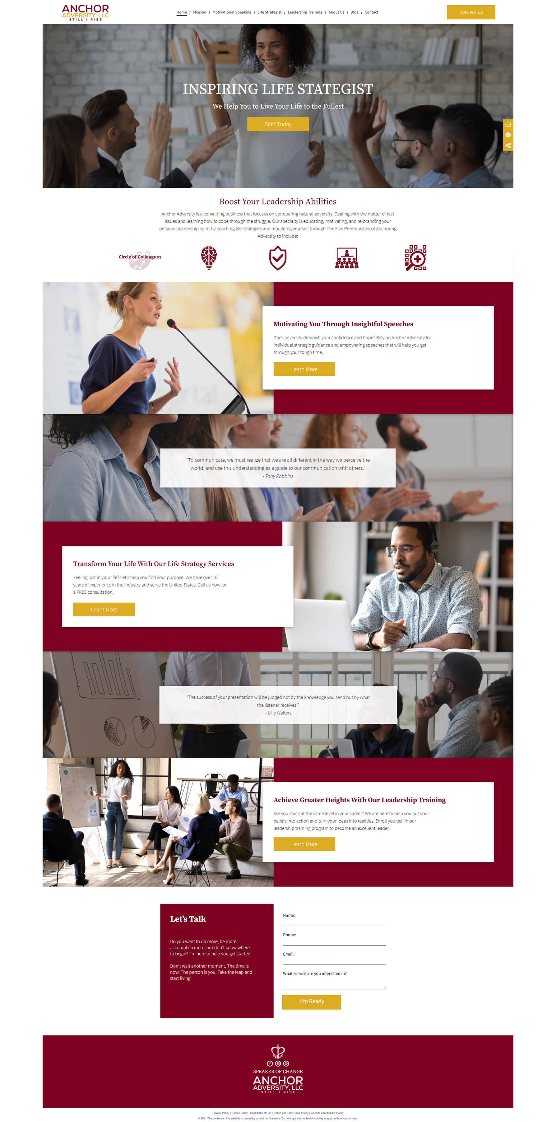
Anchor Adversity is a consulting business dedicated to helping individuals conquer natural adversity. They focus on providing education, motivation, and personal leadership coaching to help clients navigate life's challenges and emerge stronger. Anchor Adversity sought a website redesign to reflect its national reach and appeal to a larger audience.
Challenges:
Anchor Adversity's previous website did not effectively convey its message or showcase its new branding, created by a third-party graphic designer. They aimed to expand their reach beyond local audiences, posing a challenge as Hibu's SEO best practices were primarily geared toward local businesses.
My Role and Responsibilities:
As the Lead Designer and Project Manager at Hibu Inc., I spearheaded redesigning Anchor Adversity's website. My primary responsibility was understanding Anchor Adversity's vision and translating it into a visually appealing and user-friendly website aligned with their goals.
I implemented new plugins and features offered through the Hibu Smart Sites platform, enhancing the website's functionality and user experience. This included integrating engagement menus to drive contact, 24/7 analytics with the Hibu Dashboard, and live or virtual (video) appointment scheduling.
Approach:
I comprehensively reviewed Anchor Adversity's existing website and branding materials. Collaborating with the client, I developed a new Information Architecture (IA) and wireframe that aligned with their goals.
Utilizing Hibu's Smart Sites platform, I ensured the website was mobile-friendly, secure, and optimized for voice search. I also incorporated custom illustrations and iconography to match Anchor Adversity's branding, going beyond standard templates.
Solution:
The new Anchor Adversity website was successfully launched, featuring a modern design that effectively communicates the client's message and values. Leveraging Hibu's Smart Sites platform, the website is now optimized for SEO, helping Anchor Adversity reach a larger audience and achieve its business goals.
Results:
The redesigned website received positive feedback and has helped Anchor Adversity better showcase their services and reach a wider audience. The website's SEO optimization has led to increased traffic and engagement, contributing to Anchor Adversity's growth.
Key Takeaways:
This project underscored the importance of understanding the client's objectives and utilizing the right tools to meet their specific needs. By leveraging Hibu's Smart Sites platform and collaborating closely with Anchor Adversity, we delivered a website that exceeded their expectations, helping them grow their business and reach a wider audience.
Tools Used:
Adobe Creative Suite (Illustrator, Photoshop, XD)
CMS platform: hibu’s Smart Sites (white-labeled with Duda)
SalesForce
CRM
DISCLAIMER: The designs showcased in this portfolio represent the website as it was when I completed the entire design process. Please note that current site designs may vary from those depicted in the portfolio due to any subsequent changes made by the clients after the site was built and set live. Additionally, hibu allows for a DIY platform, enabling clients to make alterations to their sites independently.

